ONE ROOM CHALLENGE | WEEK 6 - The Big Reveal
It’s week 6 and I made it through the One Room Challenge! I had 32 days to flip a bathroom and as I type this realize how crazy that sounds. During those 32 short days I was also be running a full time design studio with multiple deadlines. I definitely felt the pressure of completing the room in time.
We tell our design clients 2-3 months minimum for a bathroom remodel, without hesitation. And there is clearly a reason that is the response because, while possible to do it in a shorter amount of time, I basically didn’t sleep for 4 weeks. The good news is, I love the results and now have a finished remodeled bathroom!
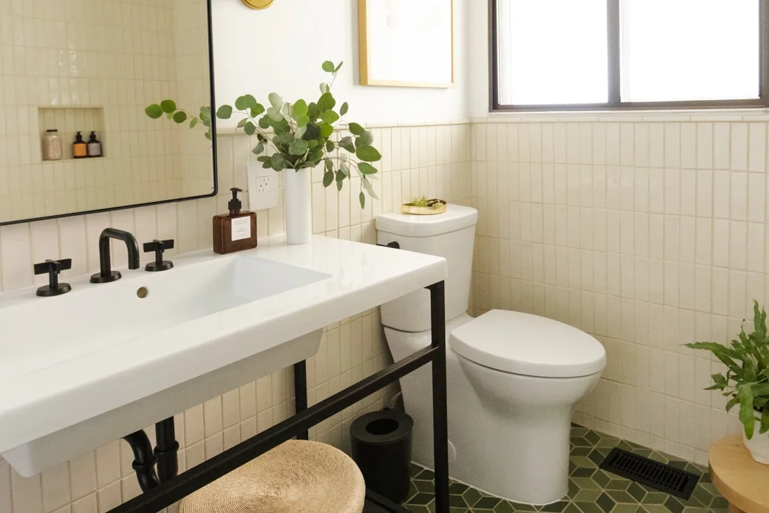
The biggest transformation is the tile. The Ranchalow was built in 1966 and the tile, I think, was original. You can see from Week 1 the transformation. I also demo’ed an awkward closet (there was a door in that mirror reflection) that was difficult to get in and out of because of the door. The space had to remain because it’s the only way into my crawl space.
Photos: Nicole Mason
I partnered with Pratt & Larson on the wall and floor tile in the Ranchalow bath. They are a family owned business and have been handcrafting tile since 1982 a few blocks away from my own studio. When selecting tile, for clients, we typically go for something a tad more time-honored or neutral. Not to be boring, but I like bathrooms to feel clean, bright and classic. Tile is a big investment and something I don’t want to change often. I like to select something that I know what the result will look like and feel confident in communicating that design idea to my client. For my own home, I wanted to explore other ideas and doing something unexpected.
WALL TILE: Pratt & Larson
When selecting a palette, I wanted to use colors from traditional Ranch and Bungalow/Craftsman style homes then balance with silhouettes that are more current. For my own bath, I opted for a cream tile. I wanted cream tile that doesn’t feel dingy or dated and Pratt and Larson has the perfect glossy cream that’s slightly iridescent. The idea of testing cream on a client doesn’t feel right since I wasn’t 100% confident with the idea but in my own home, it felt like a safe place to explore. The modern 2x6 tile stacked then paired with the handmade cream tile is the most unexpected surprise to me. I absolutely love this and can’t imagine a white tile in this room. It would feel pretty boring.
FLOOR TILE: Pratt & Larson
For the floors, I pulled three soft green colors from the Pratt & Larson Craftsman glaze collection (C50, C60 and C350) in a random pattern on their 5” diamond. The pattern created from these diamonds is so striking. I see boxes and stars and hexagons depending on where I stand!
Pratt & Larson - Custom Blended 5” diamond Tile
P&L has hundreds of simple to highly detailed tile patterns and their color palette is expansive. The colors range from classic Craftsman to contemporary and they have the ability to customize glaze colors as well as a custom blend of colors like the one I selected for my floor tile (shown above). For the floor, I chose a mix of the matte Craftsman color palette - C50 - 50%, C60 - 25%, C350 - 25%, in the 5” diamond shape. Because these tiles are hand glazed, there is a subtle variation that makes each piece unique.
This tile has so much personality and character. It adds a rich layer which P&L calls rustic but when used with a contemporary shape the combination is that perfect blend of old and new.
Pratt & Larson - Custom Blend Tile - Green Variation with custom matte black vanity
VANITY: Parnell Design
Since I have storage on the adjacent shelves and large linen closet outside of my bath, I opted for an open vanity. The room is fairly small, at 55 square feet, and creating visual openness made a huge impact on how open the room now feels even though it’s basically the same footprint. There’s a shelf below the sink for towels and baskets for everyday items.
The sink is an integrated counter sink top. Not something I normally select and I did this for two reasons. The biggest reason was timing. I didn’t think I could get the vanity fabricated and on site, a counter templated and installed two weeks later then plumbing installed in time to finish the project. I also wanted simplicity in materials. The sink is the counter. The counter is the sink. Kinda nice and super glossy and easy to clean!
LIGHTING: Hudson Valley Lighting
Wall sconces are an excellent way to add a source of accent or general lighting in the bathroom. The best place for lighting at the vanity is on each side of the mirror. It creates the most even light on your face. For the Ranchalow, I selected the Aged Brass Cornwall Sconce from Hudson Valley, and located one at each side of my mirror. Because my space is small and the profile of the sconce is as important as seeing it from the front, the Cornwall won! I love the brass finish and classic details that take inspiration from a 20th-century apothecary sink with the pipe and ball metalwork. It’s timeless and modern at the same time!
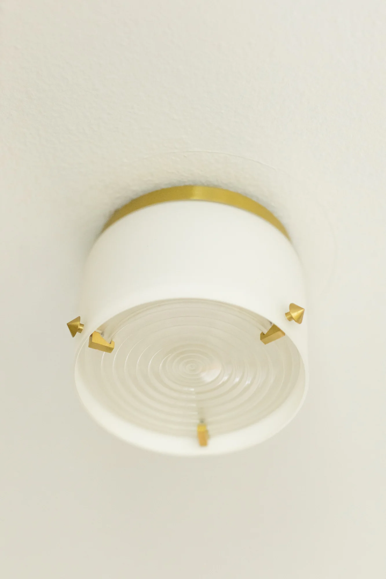
The Blackwell surface mount from Hudson Valley is also perfect for this little bath. The details from the attachment points to the clear diffuser, signature diffuser, a piece of engineered “Fresnel glass” that was first used in lighthouse lense paired with a frosted shade fit the classic modern look I am wanted to achieve.
Surface Mount Light - Hudson Valley Blackwell in Satin Brass
Sconce - Hudson Valley Cornwall in Aged Brass
ELECTRICAL: LeGrand - the adorne collection
I put dimmers on everything! Always. It’s so nice to be able to control the level of light. The Legrand adorne dimmers and switches are the nicest and easiest switches I have ever personally installed. They look incredible, and are thoughtful from cover plate to how the outlets nest to take up less visual space.
The best part about the adorne collection is the installation. I was so behind with installing tile and other elements I wasn’t able to install the switches and dimmers until the last day before my photoshoot. Since I hadn’t installed them before, I was concerned the install would be complicated but each piece nested into it’s plate easily and the cover plate went on with a snap. Legrand has handy install videos and each piece comes with detailed install instructions. I’m planning to install the adorne dimmers in the rest of my house and can’t wait to have the ease of control and clean look throughout.
the adorne collection - GFCI Outlet
the adorne collection Whisper Dimmer
the adorne collection - GFCI Outlet
the adorne collection - Switch + Dimmer with Brass Wall Plate
HARDWARE: Emtek
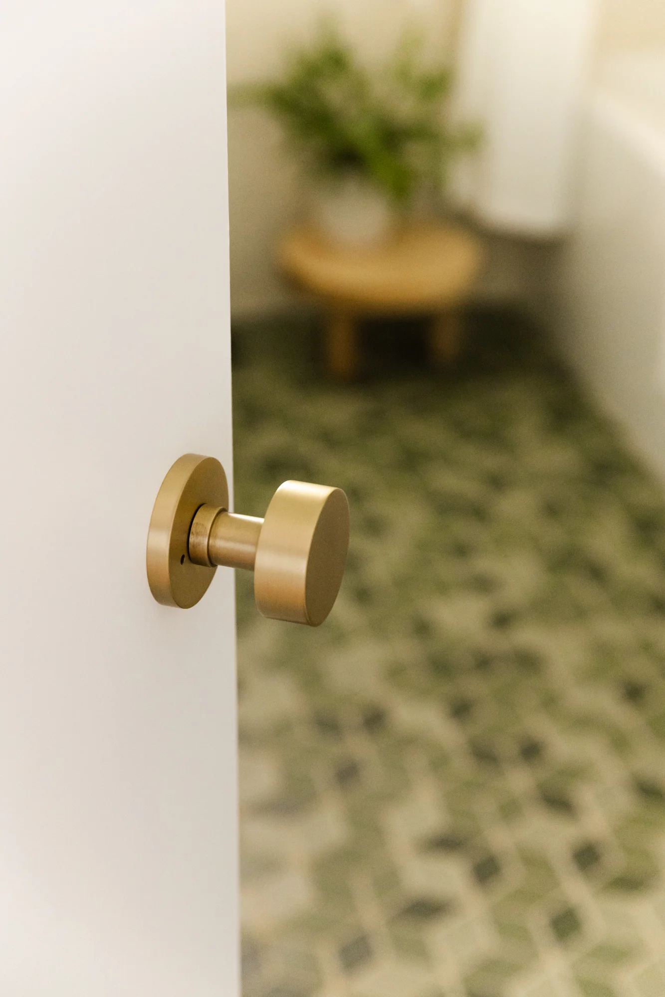
I’ve been using Emtek for years. I have their front door keyless hardware and it’s changed my life. The brand is one of my go to sources when selecting door hardware for clients. It is simple, incredibly well made and both their Modern accessory collection and Contemporary door hardware collection are a go to.
I typically stick with one finish for hardware but here I mixed the matte black plumbing fixtures and hooks with brass lighting and door hardware. I like the lightness of the brass and warmth it brings. Everything in brass would have been too much for me and all black would look too heavy. The black plumbing fixtures, vanity and accessories with clean lines give the room just enough contrast and weight.
Emtek - Bathroom Hook in Matte Black
Emtek - Door Knob in Satin Brass
Emtek - 30” Towel Bar in Matte Black and Contemporary Round Door Knob with Disc Rosette
PLUMBING: Watermark
The Blue 37 deck mounted faucet from Watermark was the first thing I selected for my home. I’ve specified these fixtures for clients before but never had them in my own home. Watermark is based in Brooklyn and is a true manufacturer. Their ability to customize and mix and match parts and pieces from each collection, make the possibilities endless.
Watermark - Blue 37 Deck Mounted Faucet
Watermark - Blue 37 Deck Mounted Faucet
Delta - Trinsic Shower Set and Handshower
PLUMBING: Ferguson, Delta and DXV
For the shower set and toilet, I worked with Helen from Ferguson. We finalized the Delta Trinsic Collection in matte black for the shower and the DXV Equility toilet with a custom matte black flush handle. The finish and style compliment the Watermark pieces at a lower price point. When looking for toilets, the Equility is a great option in that it’s skirted (it doesn’t have the flat piece at the bottom that is a dust trap) and has a modern look and high efficiency flush.
DXV - Equility Toilet
ARTWORK: Minted
Art makes a huge impact in a room and Minted is one of my go to resources for art by independent artists. The best part, aside from an amazing collection of original art and prints, is Minted frames the art in the frame of your choice. It arrives ready to hang and not sit around in a box for a few months until you are able to get it to the framers. Win!
I selected pieces from artist Caryn Owen, Alicia Youngken, Francesca Iannaccone
Minted - Artwork Caryn Owen - curaçao shown above
Minted - Alicia Youngken - Living Large shown above
Minted: Francesca Iannaccone - the Balancing 2 shown above
ACCESSORIES: Unison Home
When it comes to accessories, for a bathroom I look to Unison Home. They carry all of the final touches for a modern bathroom. The quality is great and the collection feels curated but not exclusive. The elevated every day items, like my favorite, the Ribbon Black Shelves and the Stitch black and white towel that have amazing quality at a reasonable price.
Unison Home Black Band Hamper, Logan Towel and Black Band Basket
MIRROR: Varaluz
When selecting a vanity mirror, I started by considering style and size once the vanity is finalized. As a rule, an every day mirror should measure smaller than the vanity and be at least 6’ high. For my bath, I selected the Kye Black Rounded Corner Mirror from Varaluz. It’s narrow enough for two sconces to sit on each side without being wider than my vanity and tall enough for someone over 6’ to look into it without ducking. The rounded corners and the matte black steel frame compliment the gentle curved lines of the Watermark faucet.
Varaluz - Kye Rounded Rectangle Mirror detail
Varaluz - Kye Rounded Rectangle Mirror
Varaluz - Kye Rounded Rectangle Mirror
ACCESSORIES: Matthew P Willams - low table in natural
The final accessory I added to the bathroom is the Low Table in Natural from Portland based Matthew Williams. It is the perfect spot for my fern and the chunky legs and lower height fill the corner without taking too much space I love the playful nature of this piece.
Check out the other One Room Challenge Participants and their Big Reveals!
At Home With Ashley | Dorsey Designs | The Farmhouse Project | Home Made by Carmona | House of Funk | House of Jade Interiors | House Seven Design | House That Lars Built | Inspired by Charm | Jana Bek | Jessica Brigham | Kelly Golightly | Murphy Deesign | The Pink Pagoda | Sarah Gunn | Sherry Hart Designs | Sugar & Cloth | Veronica Solomon | Vintage Revivals |


