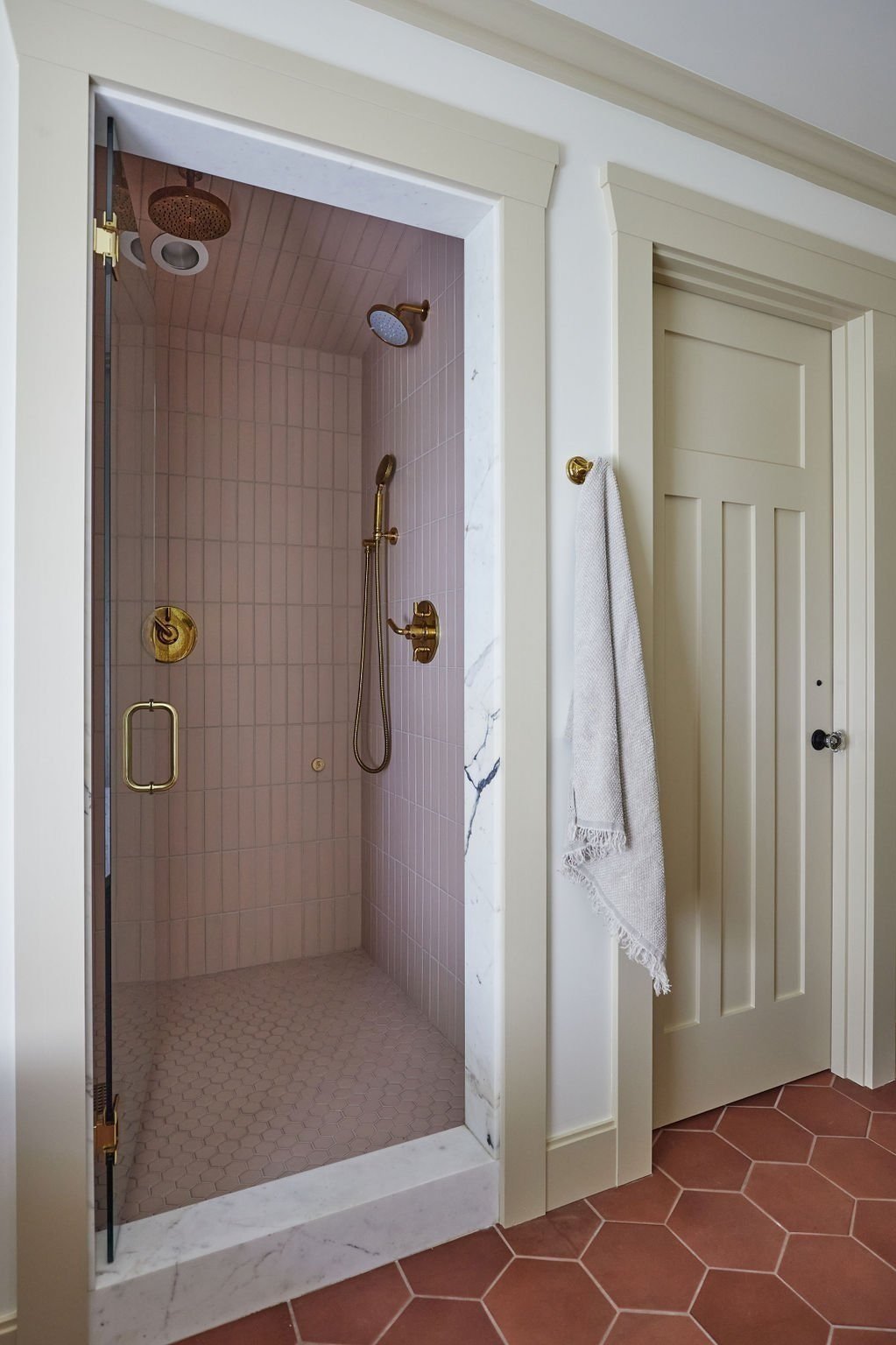
At the height of the pandemic, a growing family approached Casework with a challenge: reinventing their recently purchased 1915 Seattle Dutch Colonial that needed to be stripped to the studs. The previous owner had held court for a half-century. The longtime empty nester had remained remarkably faithful to an unremarkable ’70s-style renovation, with the exception of updating some appliances. The classic four-bedroom, 3.5-bathroom and its dormered second floor necessitated a full-scale restoration. The family wanted to preserve as much of the original structure as possible while giving it a fresh and functional update that felt in line with their style, all while keeping in mind the character of a turn-of-the-century home.
The homeowners wanted their kitchen and dining room to be inviting for large gatherings and intimate family meals. Casework blended the painted cabinets with wood cabinets, warm hues, and elegant wallpaper, anchored by a bespoke dining table that would become an heirloom in its own right. The dining room has a paneled ceiling and walls to add warmth and coziness. The kitchen contrasts the dining room wallpaper and cerused oak cabinets.
No formal dining room was included in the renovation. Instead a table that was open to the kitchen and could serve 4 as easily as it could serve 10 was planned.
Throughout the Seattle home, Casework incorporated vintage elements to infuse the space with history and character, including a 19th-century Jacobean hutch in the dining room and custom wood furniture designed to last for decades.
Keywords
LAYERED hospitality
ARTFUL
ORGANIC
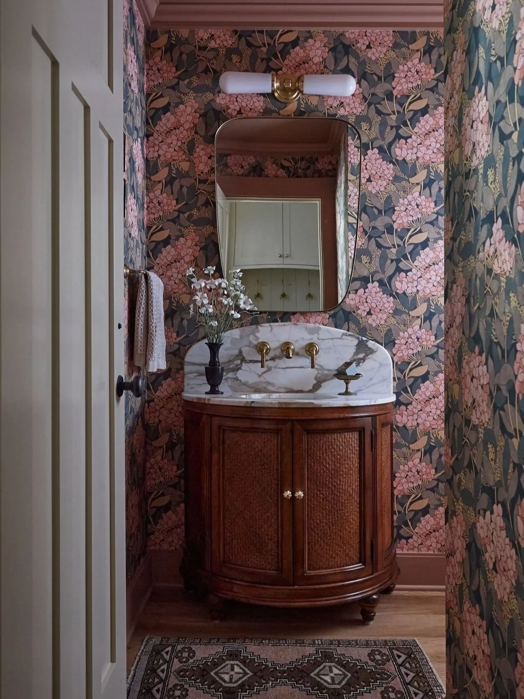
Casework and the homeowners embraced Soft Maximalism as a concept, brimming with color and pattern, meticulously coordinating six different wallpapers and abundant custom upholstery and drapery.
The primary bedroom, bathed in natural light and infused with texture, is a serene retreat with wood paneling, grasscloth, and a boucle bed, all connected to the outdoors through delicate floral-themed drapery. Grasscloth wallpapering in a neutral color and wood paneling on the vaulted ceiling add richness and architectural details that make the room feel special—a space that feels warm but also calming.
The addition on the second floor allowed for an actual primary suite with vaulted ceilings, a walk-in closet and en suite bath. The primary bedroom features neutral textures, wood paneling, a shearling bed, and floral drapery that connects the space to the outdoors.
Casey mixed and matched the various colors and patterns in the home, creating visual harmony with seemingly disparate looks and styles. Throughout the primary and children’s bedrooms, carpets and rugs added a tapestry of textures and patterns, beautifully balancing geometric plaid with organic elements. Her philosophy is that decorating with color and pattern is not so tricky when you consider all the layers and look at things with an editor’s eye.
A plaid runner on the stairs contrasts in scale with the plaid carpeting in the basement family room, where a mixture of plaids and florals combine. The dark and dramatic basement includes a playroom, workout area, home office, and guest suite.
“When selecting color and pattern, we start with a foundation,” Casey explains. “I usually look for a unifying element, most often color, and play from there. I prefer color to have balance, a mix of tones and patterns that are not too similar in scale or color because to me that feels too busy. I actually like it when patterns clash, like a plaid and floral, or a large floral and a small ditsy print or stripe.”
Ready to work with us?
Credits
Special thanks to Res Loci and Toth Construction who helped accomplish the goal of saving the entire shell of the house, plus the front windows and shutters. The final result was a contemporized embrace of the intimate scale of the original house heightened by a color, pattern, and materials exploration in every room. The renovated home cohesively flows from one room to the next—each working in tandem while maintaining a unique identity.
Design: Casey Keasler, Marla Kabashima, Miranda Williams
Photography: Emily Kennedy
Interior Styling: Jorie Garcia and Casey Keasler
Press: Seattle Magazine | Sunset Magazine


